Prohoc
Started in 1996 as a support function of a local ice hockey club, Prohoc is now a key part in the invisible backbone of global industry. Make it Simple has been part of Prohoc’s growth story since 2013.
The Core
Prohoc is an industrial project partner that, as an agile challenger, has always adapted to the prevailing world situations and the needs of its customers. Prohoc is used to battling for people – clients or crew – against ever-bigger players.
Prohoc’s strong value-based vision extends from offices to construction sites, from everyday life at home to foreign assignments. As a global player, Prohoc’s influence continues to grow.



The Partnership
Shared values are the basis of trust. We also have a shared desire to exceed expectations – again and again.
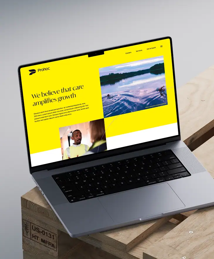
Make it Simple has been involved in everything from strategy workshops to workwear labels, from sales presentations to magazine publications and laptop stickers. We have even commissioned sofa furniture in the shape of a Prohoc symbol (2014 never forget).
Sustainable communication actions can be traced directly to Prohoc’s strategic vision. At the heart of everything is caring – human, economic and planetary responsibility. Full-spectrum partnership.

Creative solution
Strategy
- Brand story
- Key messaging
- Persona & position
- Voice & tone
Design
- Identity system
- Color & type
- Brand applications
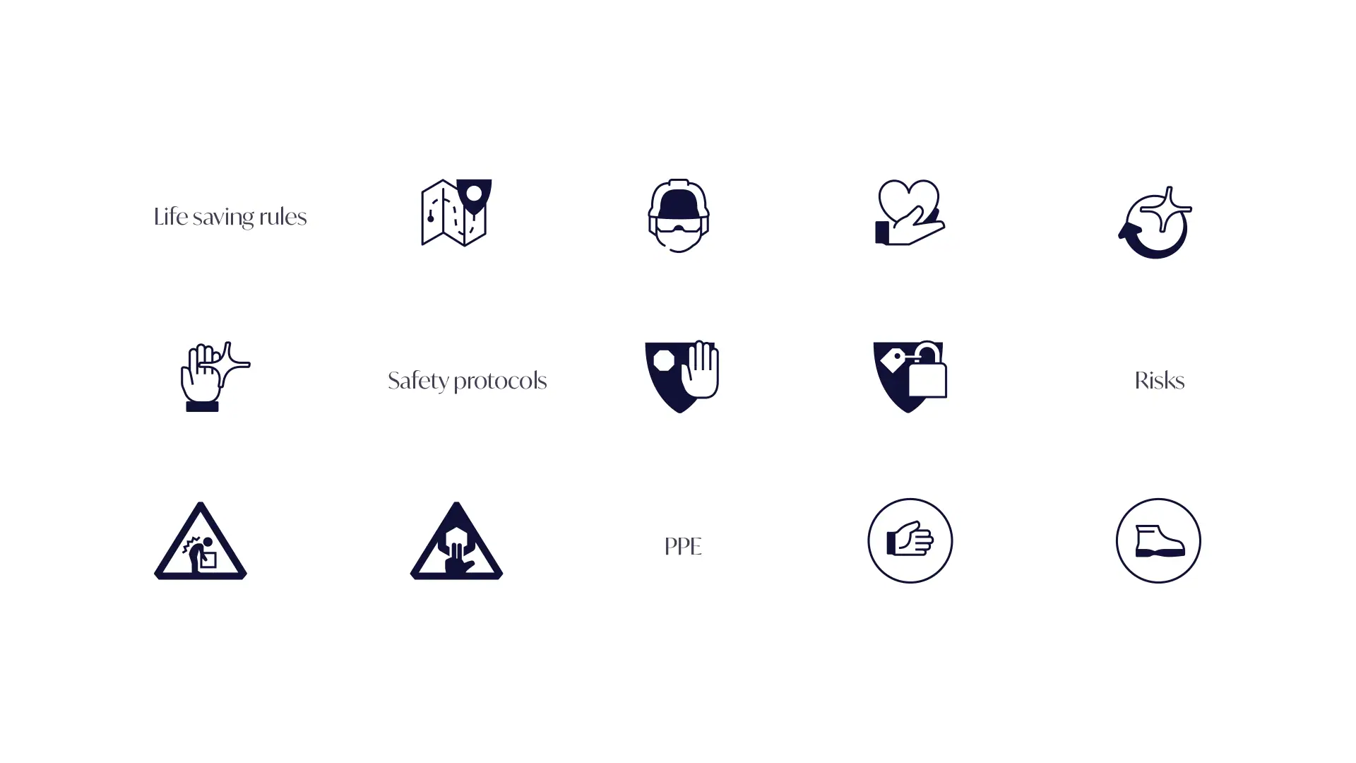
- Icon library
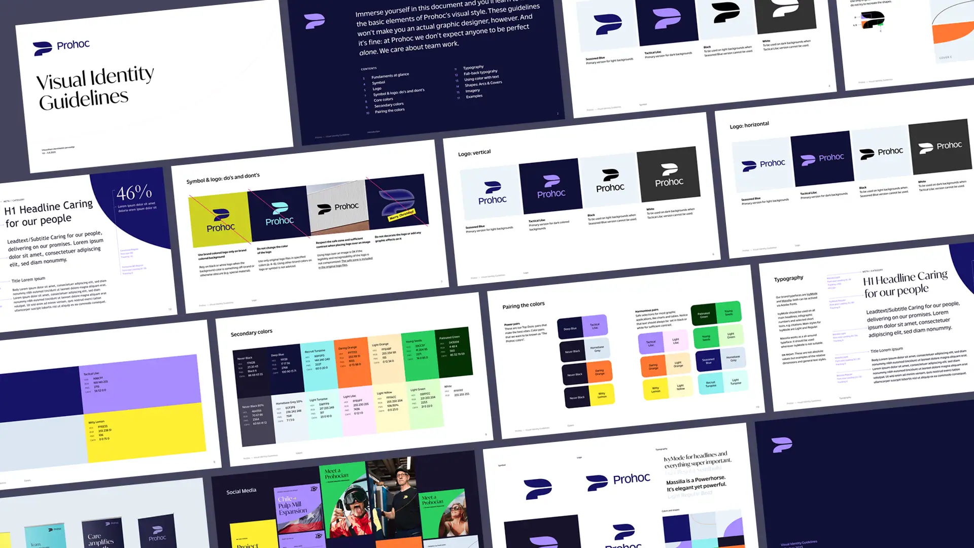
- Brand guidelines
- UI/UX design
Content
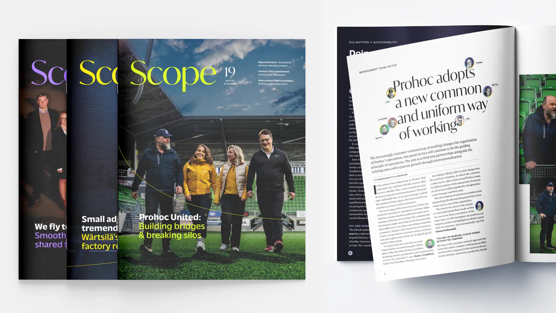
- Stakeholder magazine
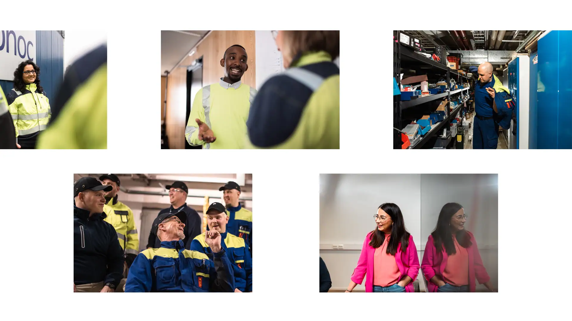
- Photography
- Illustrations
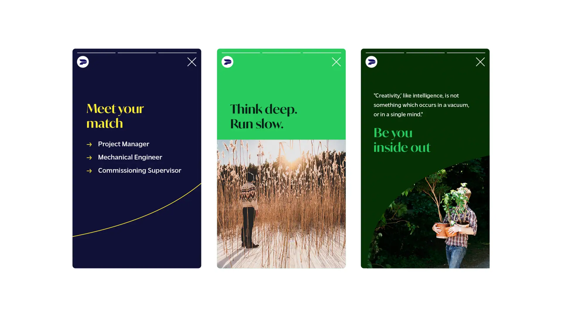
- Social media templates