Turva
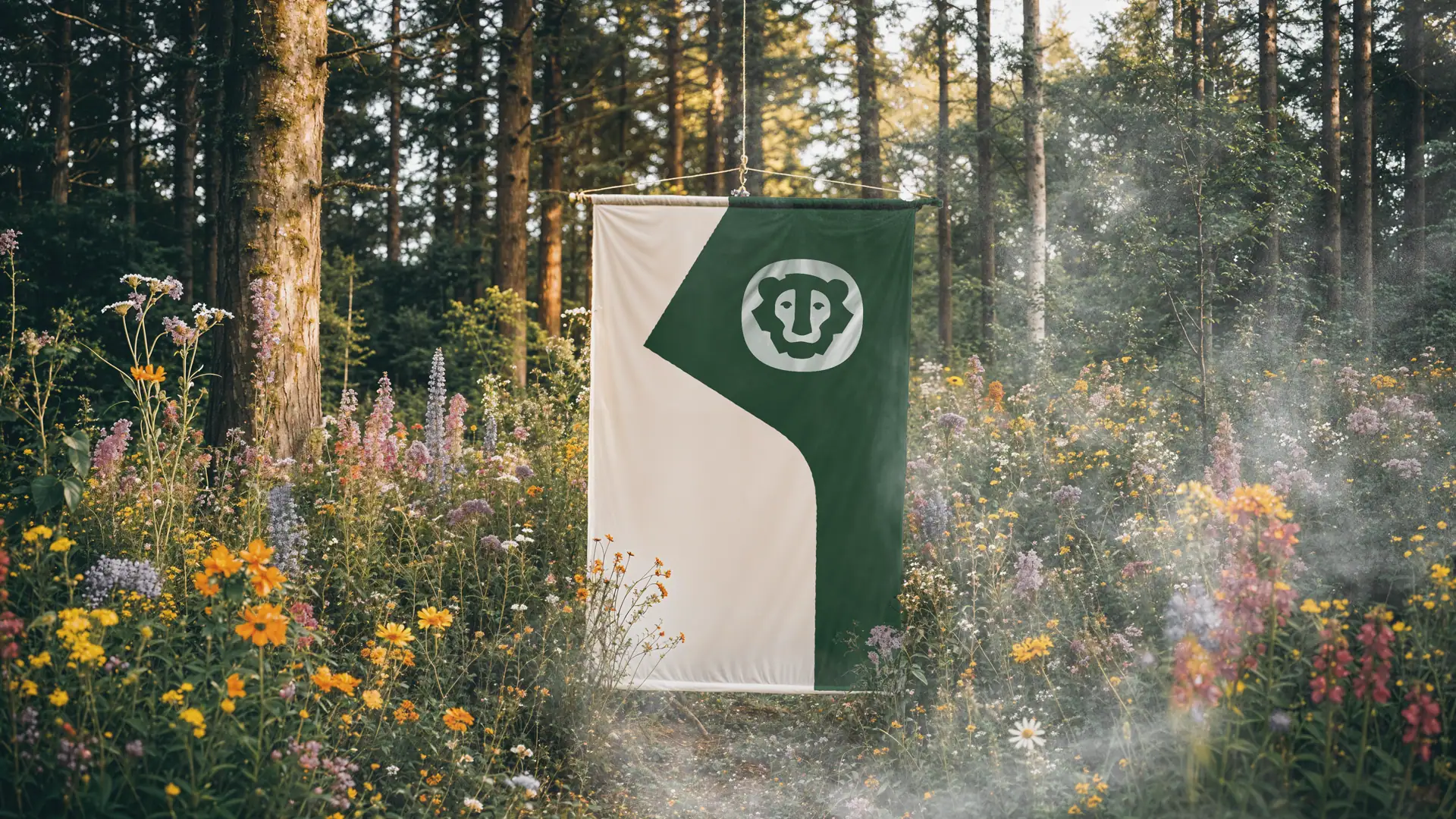
We partnered with Turva Mutual Insurance Company (Turva is Finnish for safeguard; safety) to design a new face for the friendliest company in the Finnish insurance business. No stone was left unturned as we sought just the right balance between reliability and wit.
The challenge
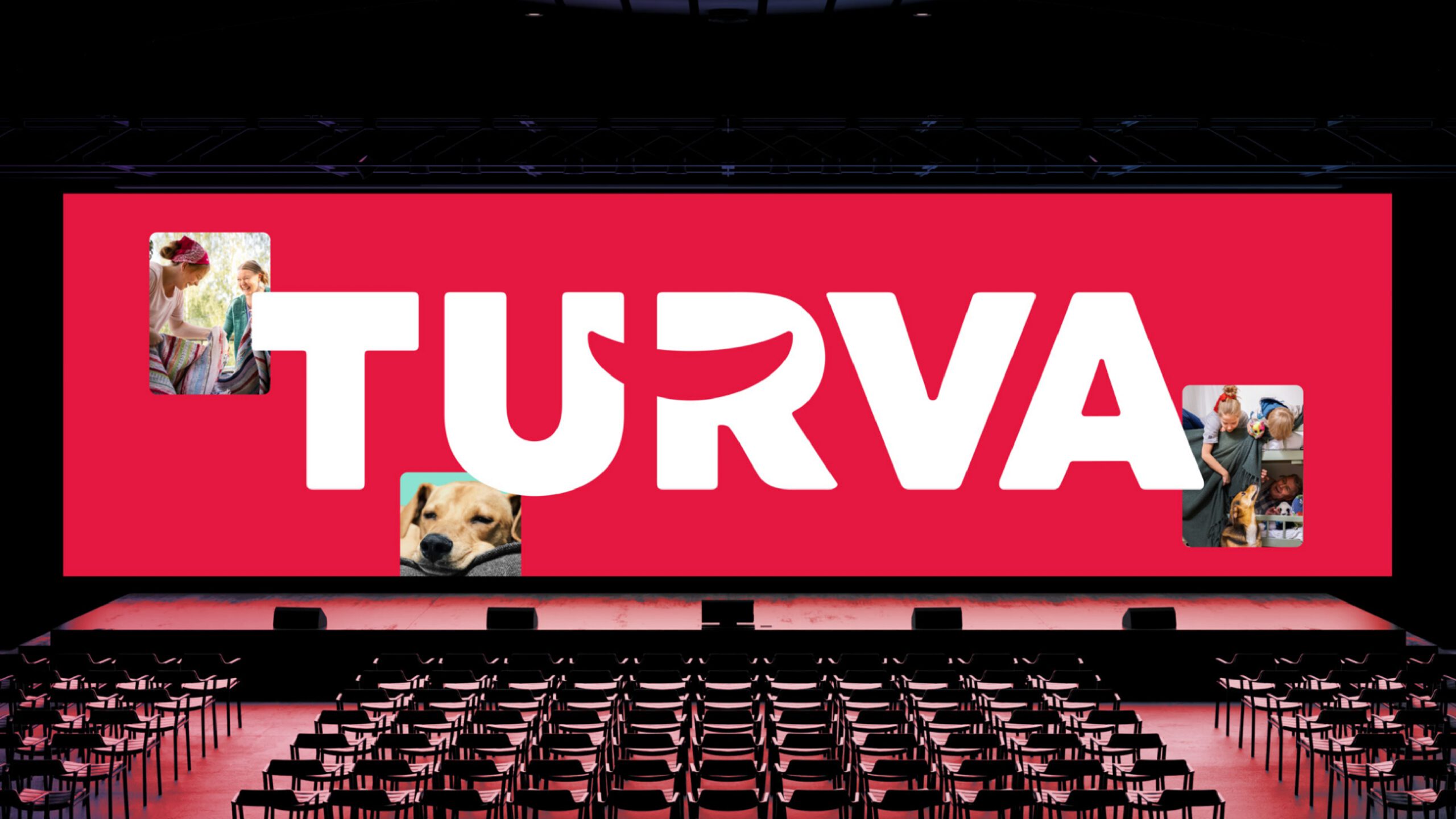
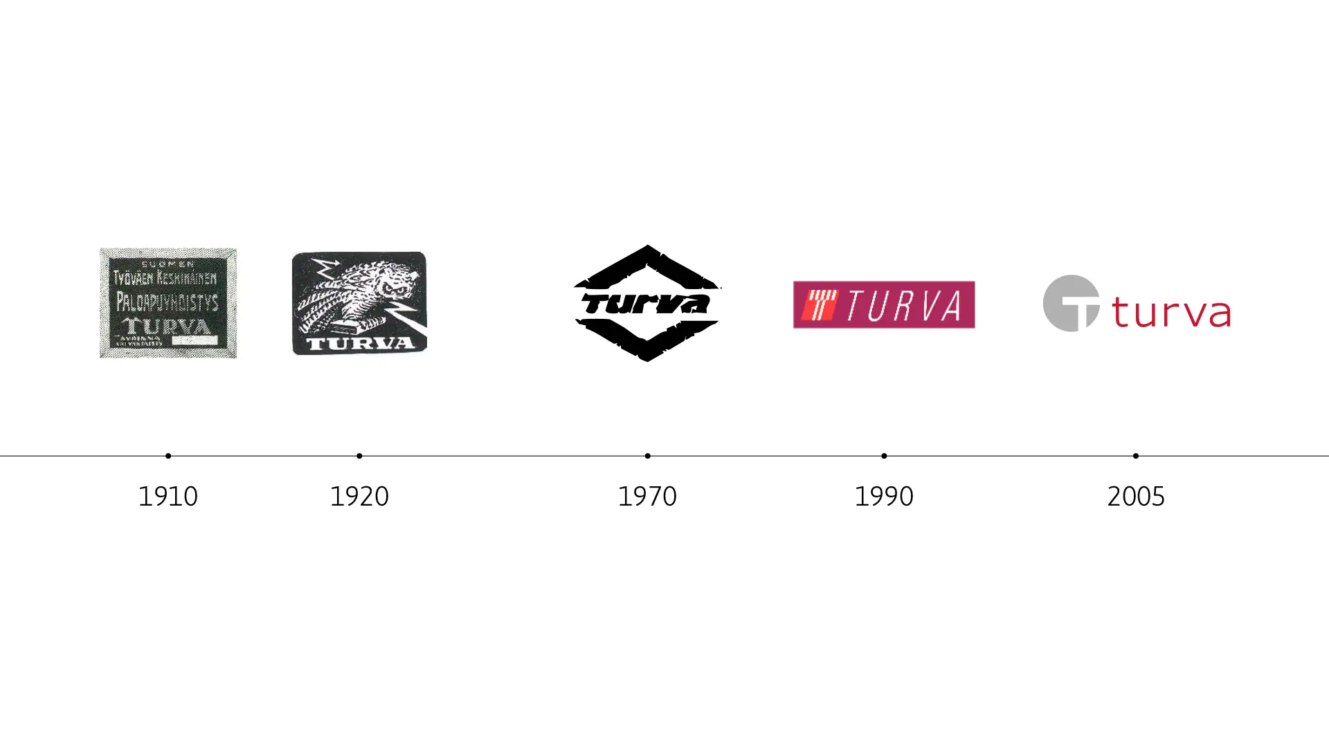
Turva’s strategic renewal required an update to the brand’s external appearance, to better reflect the desired brand image. Turva is all about smile and straightforwardness, certainty and peace of mind.
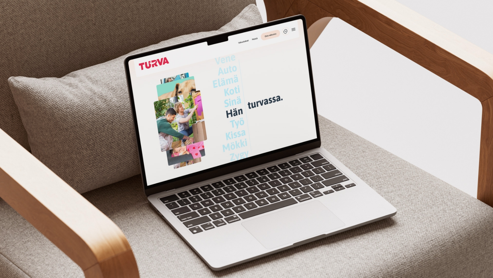
At the heart of the renewal was improving the usability of the logo, especially in the digital environment.

The progress
An insurance company known for its excellent customer service will cheer you up from the first meeting, despite your concerns.
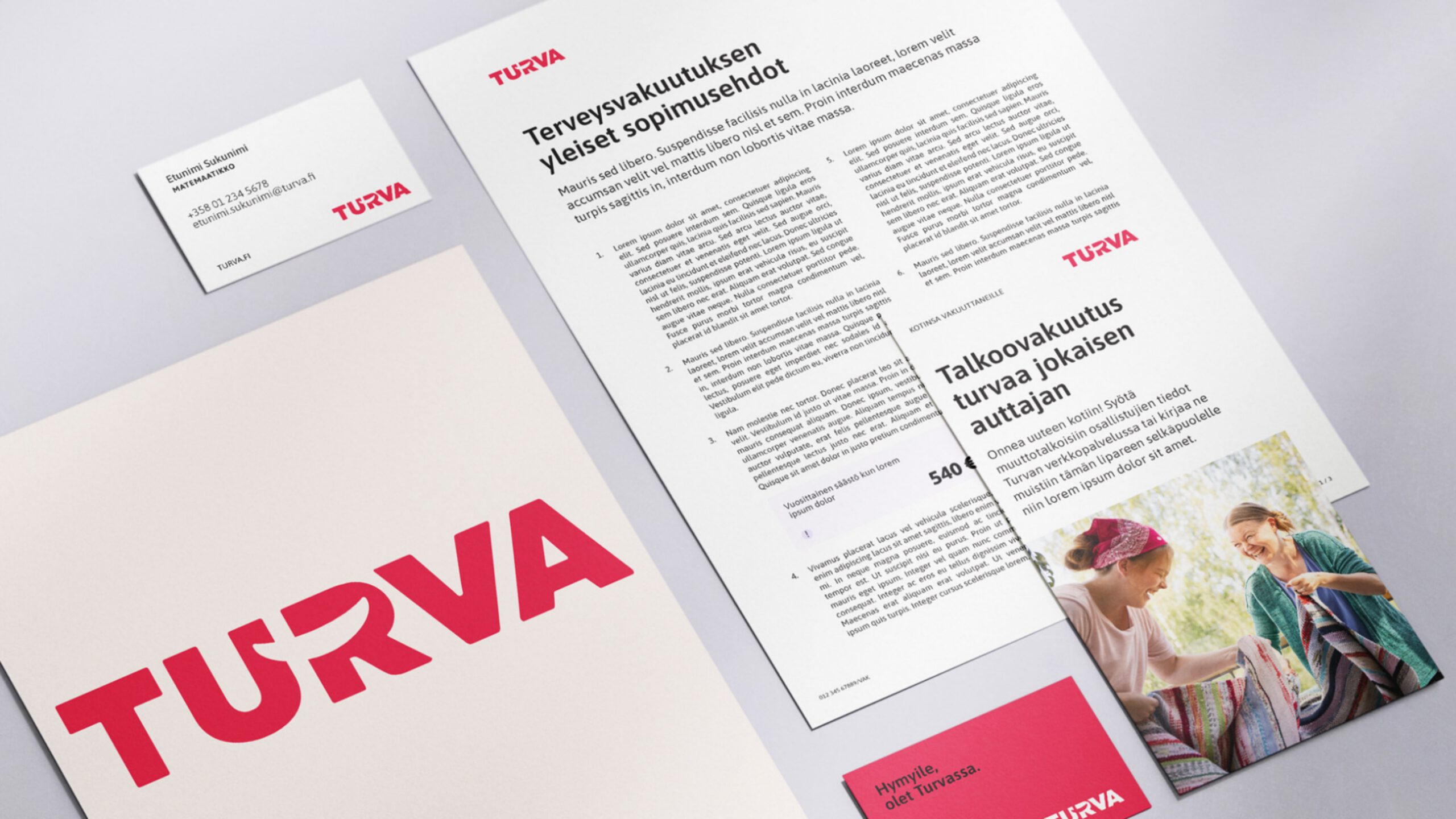
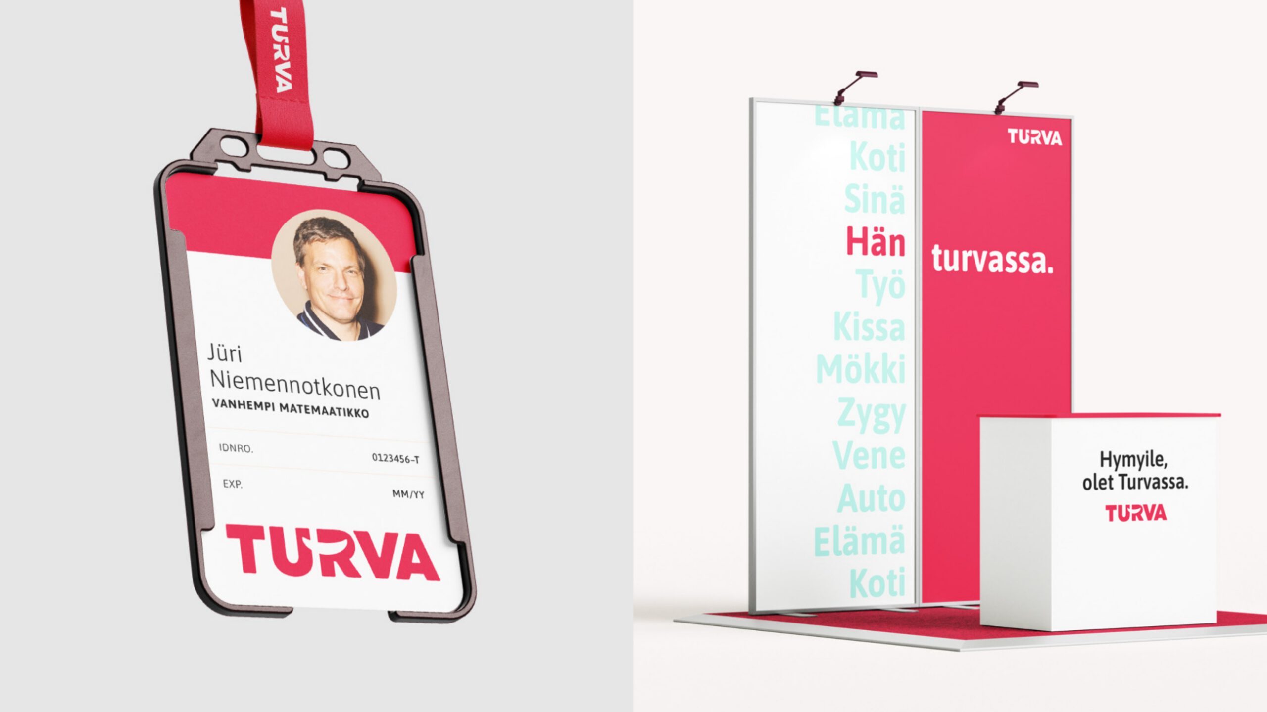
The new logo gives the name the attention and weight it deserves. At the same time, the overall look of the brand has been unified. Turva has become more accessible, in every touch point.
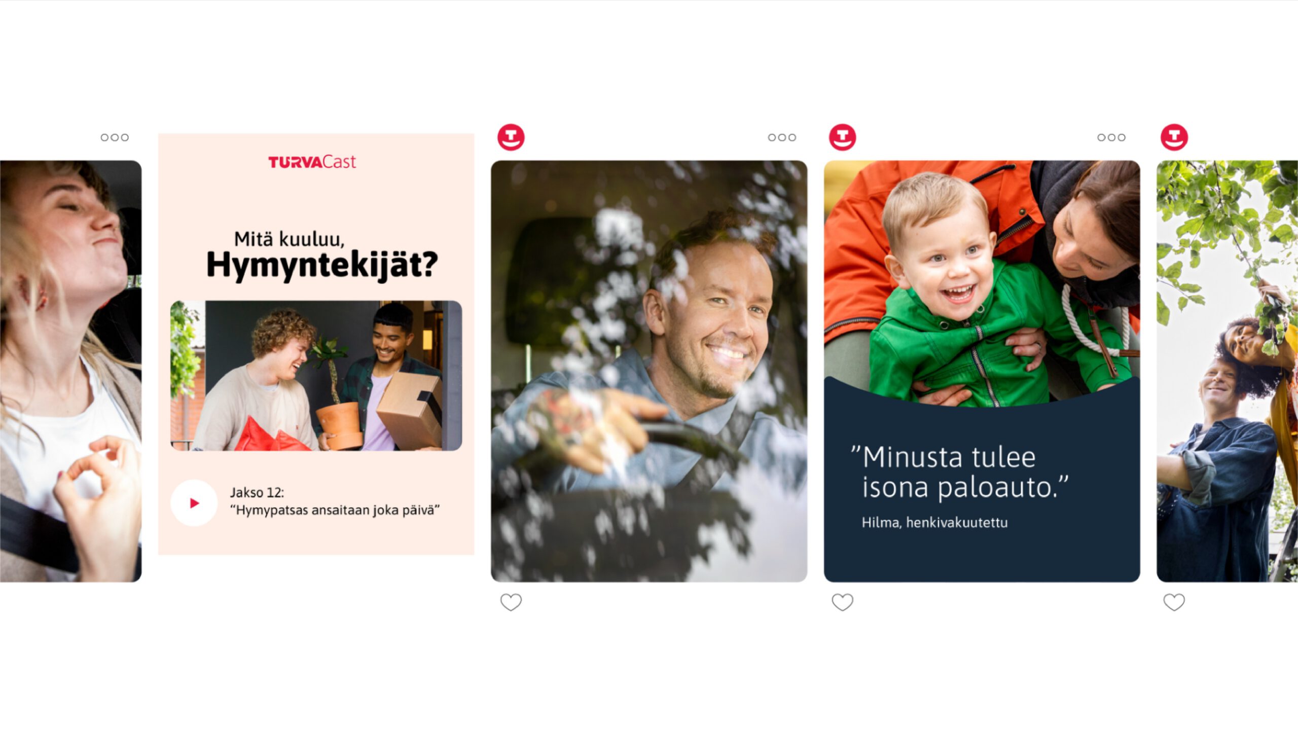
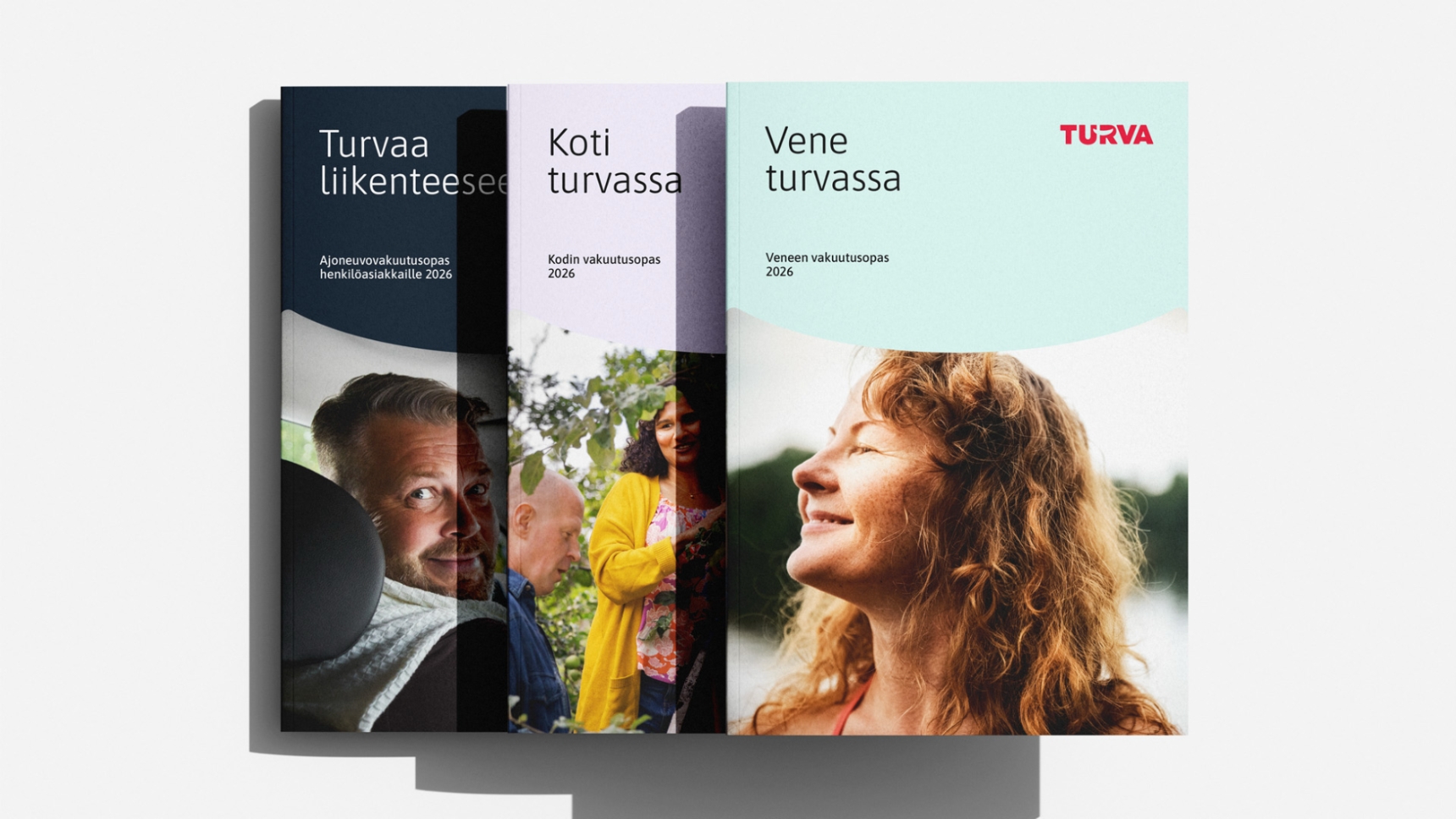
A thoughtfully expanded color palette and refined typographic guidelines make it easier to design and use services.
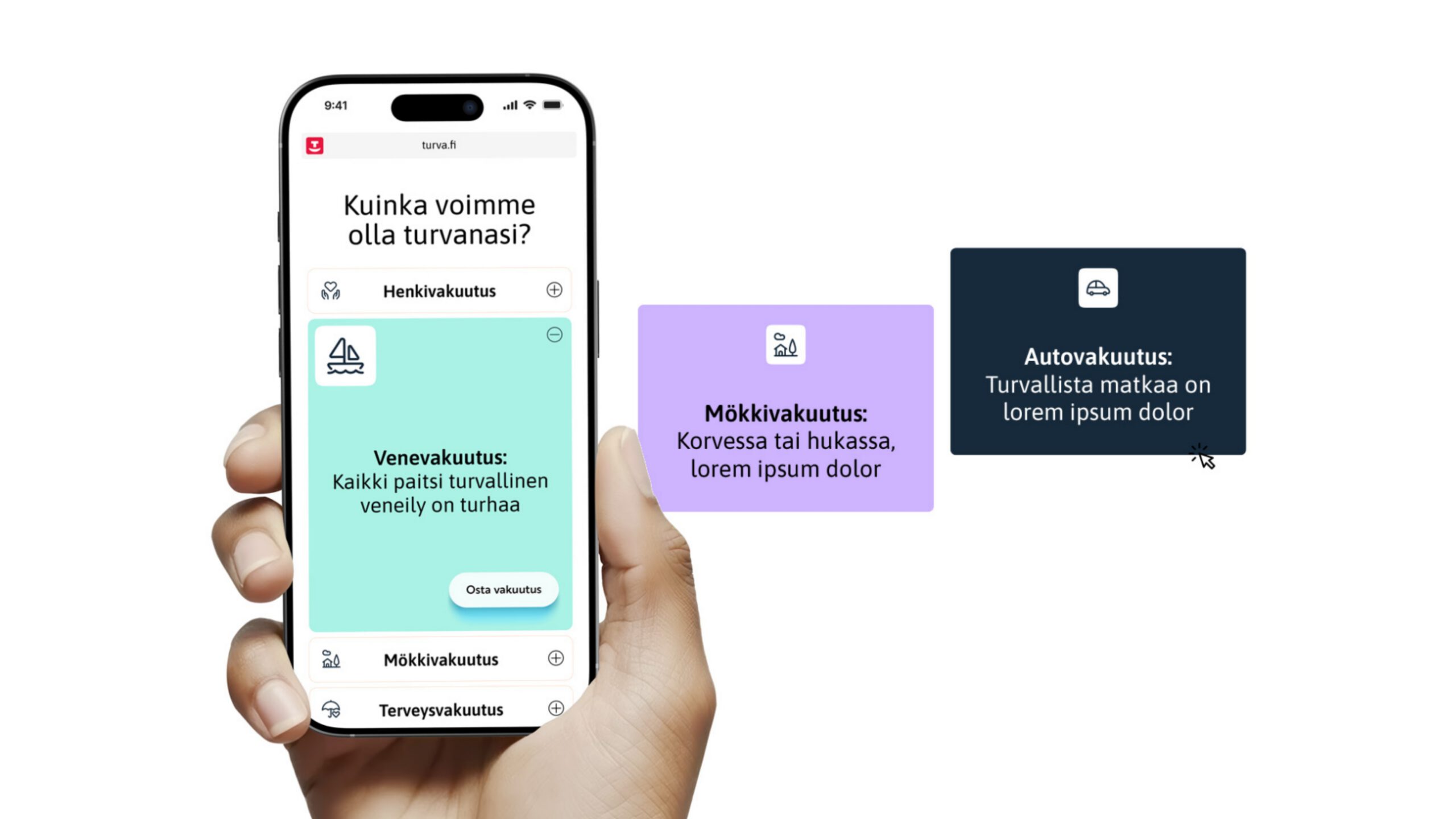
Creative solution
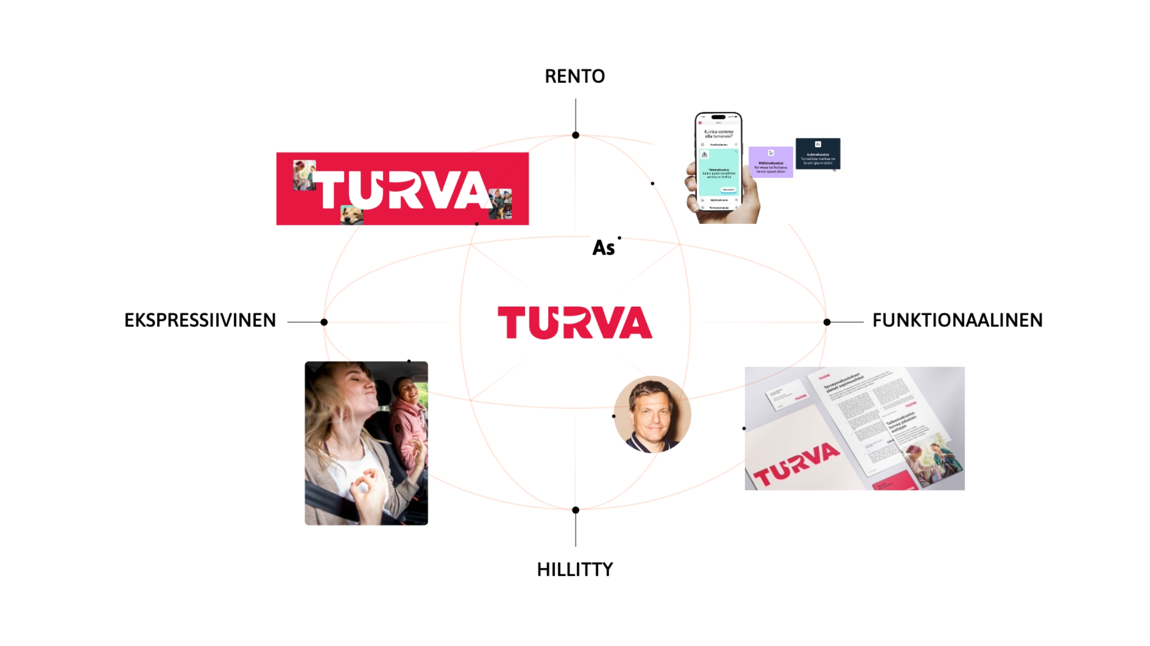
- Identity system
- Color & type
- Brand applications
- Identity guidelines
- UI design
- Animation design
- Social media templates
- Advertising templates